Visualising with matplotlib#
matplotlib is the OG plotting library in Python. If you want to do powerful or basic visualization in Python, matplotlib is a great place to start.
The challenge comes from matplotlib’s power. You can draw anything in matplotlib. That’s great, but can lead to a complex and sometimes confusing interface.
matplotlib’s strength and origins are in publication quality graphics, that is creating highly precise figures for use in papers, etc.
import matplotlib.pyplot as plt
import numpy as np
plt.plot?
Signature: plt.plot(*args, scalex=True, scaley=True, data=None, **kwargs)
Docstring:
Plot y versus x as lines and/or markers.

Call signatures::

    plot([x], y, [fmt], *, data=None, **kwargs)
    plot([x], y, [fmt], [x2], y2, [fmt2], ..., **kwargs)

The coordinates of the points or line nodes are given by *x*, *y*.

The optional parameter *fmt* is a convenient way for defining basic
formatting like color, marker and linestyle. It's a shortcut string
notation described in the *Notes* section below.

>>> plot(x, y)        # plot x and y using default line style and color
>>> plot(x, y, 'bo')  # plot x and y using blue circle markers
>>> plot(y)           # plot y using x as index array 0..N-1
>>> plot(y, 'r+')     # ditto, but with red plusses

You can use `.Line2D` properties as keyword arguments for more
control on the appearance. Line properties and *fmt* can be mixed.
The following two calls yield identical results:

>>> plot(x, y, 'go--', linewidth=2, markersize=12)
>>> plot(x, y, color='green', marker='o', linestyle='dashed',
...      linewidth=2, markersize=12)

When conflicting with *fmt*, keyword arguments take precedence.


**Plotting labelled data**

There's a convenient way for plotting objects with labelled data (i.e.
data that can be accessed by index ``obj['y']``). Instead of giving
the data in *x* and *y*, you can provide the object in the *data*
parameter and just give the labels for *x* and *y*::

>>> plot('xlabel', 'ylabel', data=obj)

All indexable objects are supported. This could e.g. be a `dict`, a
`pandas.DataFrame` or a structured numpy array.


**Plotting multiple sets of data**

There are various ways to plot multiple sets of data.

- The most straight forward way is just to call `plot` multiple times.
  Example:

  >>> plot(x1, y1, 'bo')
  >>> plot(x2, y2, 'go')

- If *x* and/or *y* are 2D arrays a separate data set will be drawn
  for every column. If both *x* and *y* are 2D, they must have the
  same shape. If only one of them is 2D with shape (N, m) the other
  must have length N and will be used for every data set m.

  Example:

  >>> x = [1, 2, 3]
  >>> y = np.array([[1, 2], [3, 4], [5, 6]])
  >>> plot(x, y)

  is equivalent to:

  >>> for col in range(y.shape[1]):
  ...     plot(x, y[:, col])

- The third way is to specify multiple sets of *[x]*, *y*, *[fmt]*
  groups::

  >>> plot(x1, y1, 'g^', x2, y2, 'g-')

  In this case, any additional keyword argument applies to all
  datasets. Also, this syntax cannot be combined with the *data*
  parameter.

By default, each line is assigned a different style specified by a
'style cycle'. The *fmt* and line property parameters are only
necessary if you want explicit deviations from these defaults.
Alternatively, you can also change the style cycle using
:rc:`axes.prop_cycle`.


Parameters
----------
x, y : array-like or scalar
    The horizontal / vertical coordinates of the data points.
    *x* values are optional and default to ``range(len(y))``.

    Commonly, these parameters are 1D arrays.

    They can also be scalars, or two-dimensional (in that case, the
    columns represent separate data sets).

    These arguments cannot be passed as keywords.

fmt : str, optional
    A format string, e.g. 'ro' for red circles. See the *Notes*
    section for a full description of the format strings.

    Format strings are just an abbreviation for quickly setting
    basic line properties. All of these and more can also be
    controlled by keyword arguments.

    This argument cannot be passed as keyword.

data : indexable object, optional
    An object with labelled data. If given, provide the label names to
    plot in *x* and *y*.

    .. note::
        Technically there's a slight ambiguity in calls where the
        second label is a valid *fmt*. ``plot('n', 'o', data=obj)``
        could be ``plt(x, y)`` or ``plt(y, fmt)``. In such cases,
        the former interpretation is chosen, but a warning is issued.
        You may suppress the warning by adding an empty format string
        ``plot('n', 'o', '', data=obj)``.

Returns
-------
list of `.Line2D`
    A list of lines representing the plotted data.

Other Parameters
----------------
scalex, scaley : bool, default: True
    These parameters determine if the view limits are adapted to the
    data limits. The values are passed on to
    `~.axes.Axes.autoscale_view`.

**kwargs : `.Line2D` properties, optional
    *kwargs* are used to specify properties like a line label (for
    auto legends), linewidth, antialiasing, marker face color.
    Example::

    >>> plot([1, 2, 3], [1, 2, 3], 'go-', label='line 1', linewidth=2)
    >>> plot([1, 2, 3], [1, 4, 9], 'rs', label='line 2')

    If you specify multiple lines with one plot call, the kwargs apply
    to all those lines. In case the label object is iterable, each
    element is used as labels for each set of data.

    Here is a list of available `.Line2D` properties:

    Properties:
    agg_filter: a filter function, which takes a (m, n, 3) float array and a dpi value, and returns a (m, n, 3) array and two offsets from the bottom left corner of the image
    alpha: scalar or None
    animated: bool
    antialiased or aa: bool
    clip_box: `.Bbox`
    clip_on: bool
    clip_path: Patch or (Path, Transform) or None
    color or c: color
    dash_capstyle: `.CapStyle` or {'butt', 'projecting', 'round'}
    dash_joinstyle: `.JoinStyle` or {'miter', 'round', 'bevel'}
    dashes: sequence of floats (on/off ink in points) or (None, None)
    data: (2, N) array or two 1D arrays
    drawstyle or ds: {'default', 'steps', 'steps-pre', 'steps-mid', 'steps-post'}, default: 'default'
    figure: `.Figure`
    fillstyle: {'full', 'left', 'right', 'bottom', 'top', 'none'}
    gapcolor: color or None
    gid: str
    in_layout: bool
    label: object
    linestyle or ls: {'-', '--', '-.', ':', '', (offset, on-off-seq), ...}
    linewidth or lw: float
    marker: marker style string, `~.path.Path` or `~.markers.MarkerStyle`
    markeredgecolor or mec: color
    markeredgewidth or mew: float
    markerfacecolor or mfc: color
    markerfacecoloralt or mfcalt: color
    markersize or ms: float
    markevery: None or int or (int, int) or slice or list[int] or float or (float, float) or list[bool]
    mouseover: bool
    path_effects: `.AbstractPathEffect`
    picker: float or callable[[Artist, Event], tuple[bool, dict]]
    pickradius: unknown
    rasterized: bool
    sketch_params: (scale: float, length: float, randomness: float)
    snap: bool or None
    solid_capstyle: `.CapStyle` or {'butt', 'projecting', 'round'}
    solid_joinstyle: `.JoinStyle` or {'miter', 'round', 'bevel'}
    transform: unknown
    url: str
    visible: bool
    xdata: 1D array
    ydata: 1D array
    zorder: float

See Also
--------
scatter : XY scatter plot with markers of varying size and/or color (
    sometimes also called bubble chart).

Notes
-----
**Format Strings**

A format string consists of a part for color, marker and line::

    fmt = '[marker][line][color]'

Each of them is optional. If not provided, the value from the style
cycle is used. Exception: If ``line`` is given, but no ``marker``,
the data will be a line without markers.

Other combinations such as ``[color][marker][line]`` are also
supported, but note that their parsing may be ambiguous.

**Markers**

=============   ===============================
character       description
=============   ===============================
``'.'``         point marker
``','``         pixel marker
``'o'``         circle marker
``'v'``         triangle_down marker
``'^'``         triangle_up marker
``'<'``         triangle_left marker
``'>'``         triangle_right marker
``'1'``         tri_down marker
``'2'``         tri_up marker
``'3'``         tri_left marker
``'4'``         tri_right marker
``'8'``         octagon marker
``'s'``         square marker
``'p'``         pentagon marker
``'P'``         plus (filled) marker
``'*'``         star marker
``'h'``         hexagon1 marker
``'H'``         hexagon2 marker
``'+'``         plus marker
``'x'``         x marker
``'X'``         x (filled) marker
``'D'``         diamond marker
``'d'``         thin_diamond marker
``'|'``         vline marker
``'_'``         hline marker
=============   ===============================

**Line Styles**

=============    ===============================
character        description
=============    ===============================
``'-'``          solid line style
``'--'``         dashed line style
``'-.'``         dash-dot line style
``':'``          dotted line style
=============    ===============================

Example format strings::

    'b'    # blue markers with default shape
    'or'   # red circles
    '-g'   # green solid line
    '--'   # dashed line with default color
    '^k:'  # black triangle_up markers connected by a dotted line

**Colors**

The supported color abbreviations are the single letter codes

=============    ===============================
character        color
=============    ===============================
``'b'``          blue
``'g'``          green
``'r'``          red
``'c'``          cyan
``'m'``          magenta
``'y'``          yellow
``'k'``          black
``'w'``          white
=============    ===============================

and the ``'CN'`` colors that index into the default property cycle.

If the color is the only part of the format string, you can
additionally use any  `matplotlib.colors` spec, e.g. full names
(``'green'``) or hex strings (``'#008000'``).
File:      ~/conda/envs/3110/lib/python3.11/site-packages/matplotlib/pyplot.py
Type:      function
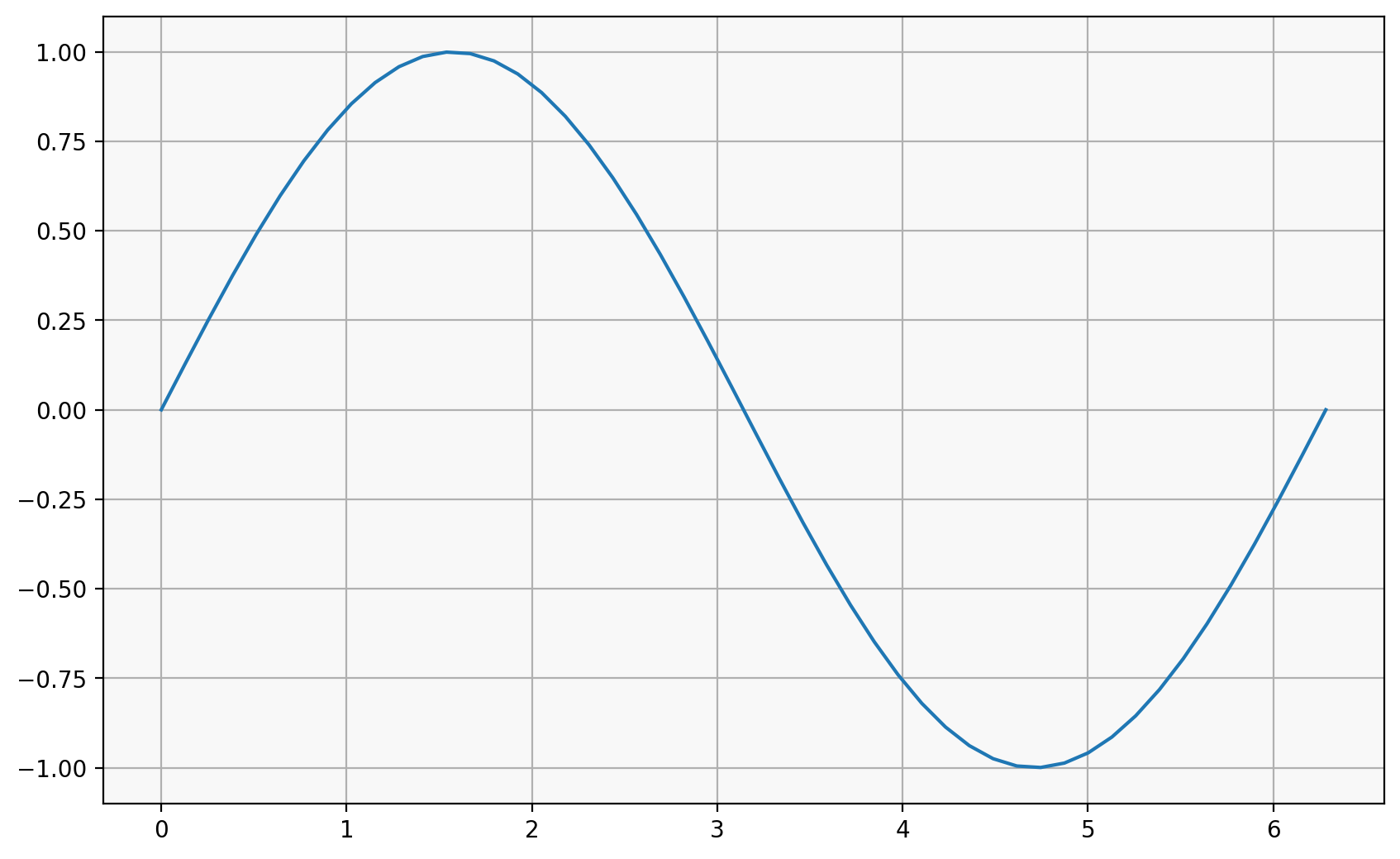
x = np.linspace(0, 2 * np.pi)
y = np.sin(x)

plt.plot(x, y)
[<matplotlib.lines.Line2D at 0x11652ba50>]
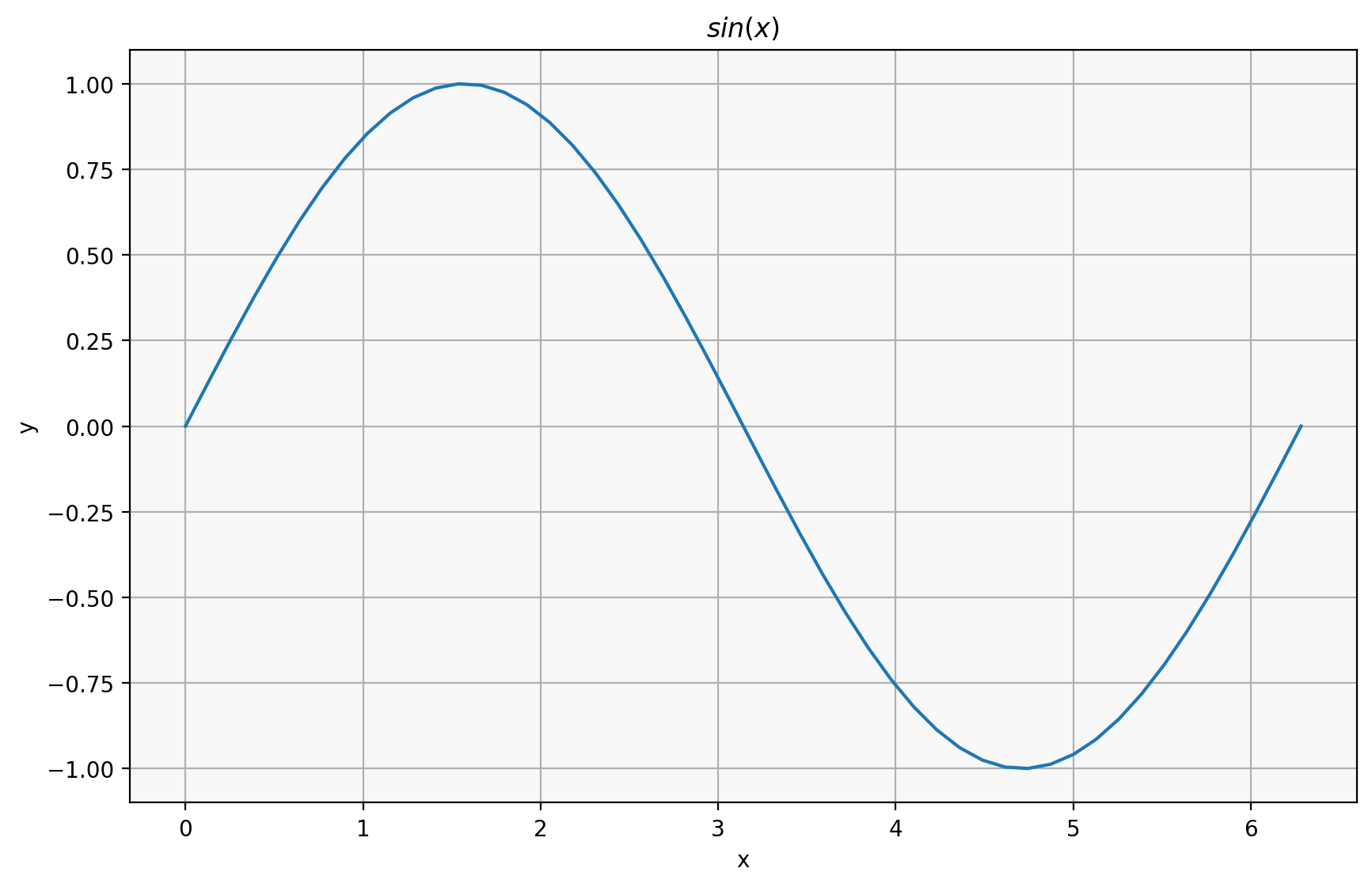
When creating a figure, there is a “figure” object and an “axes” object.
The “axes” is like a single plot, while the figure is like a single image, which may contain multiple plots:
fig, ax = plt.subplots()

ax.plot(x, y)
ax.set_title("$sin(x)$")
ax.set_xlabel("x")
ax.set_ylabel("y");
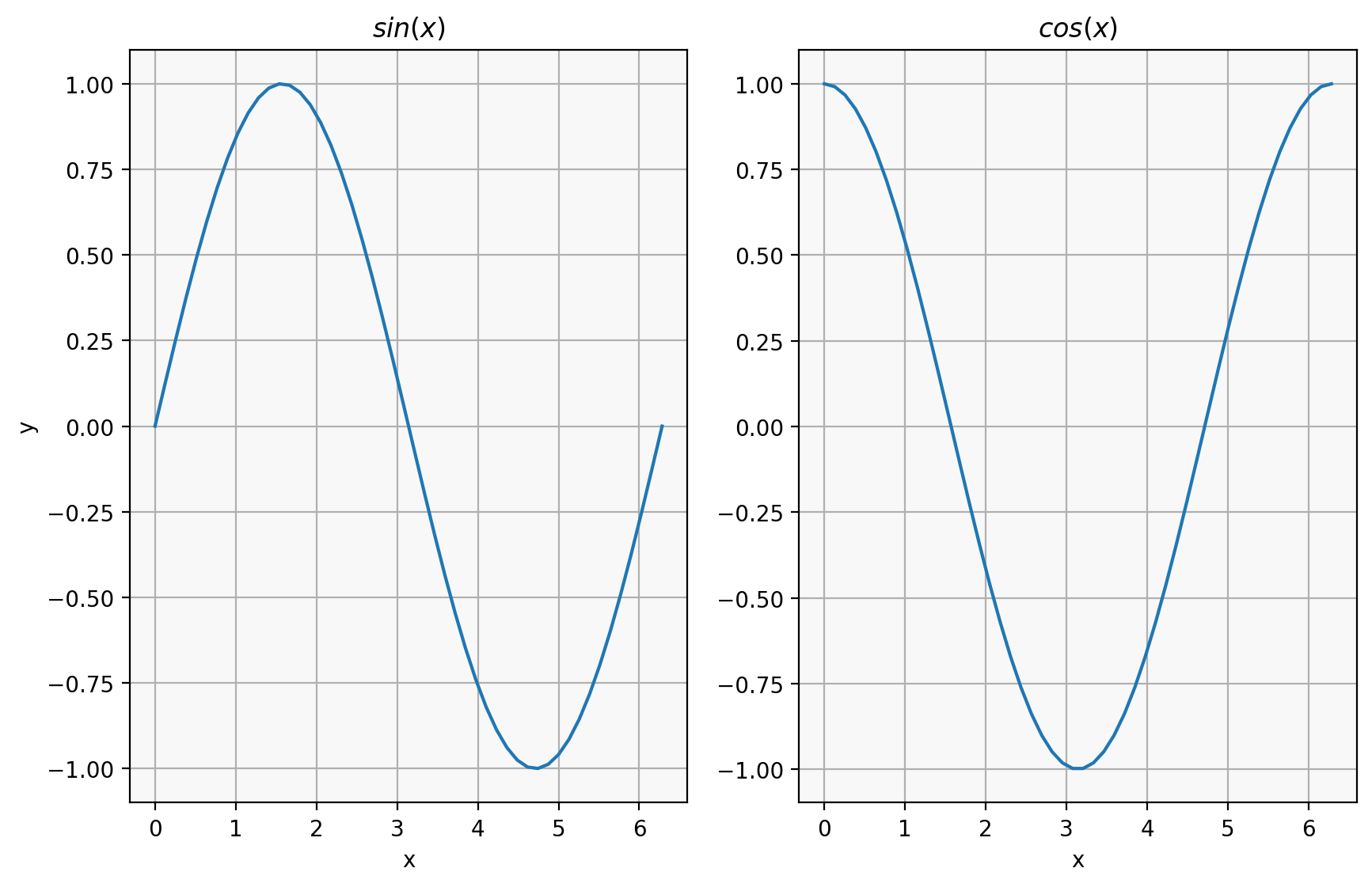
fig, (ax1, ax2) = plt.subplots(1, 2)
ax1.plot(x, np.sin(x))
ax1.set_title("$sin(x)$")
ax1.set_xlabel("x")
ax1.set_ylabel("y")

ax2.plot(x, np.cos(x))
ax2.set_title("$cos(x)$")
ax2.set_xlabel("x")
Text(0.5, 0, 'x')
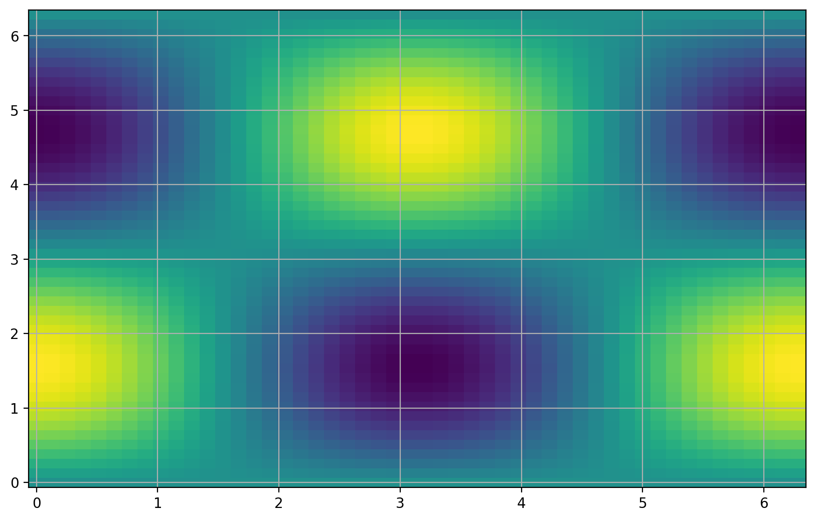
C = np.outer(np.sin(x), np.cos(x))
plt.pcolor(x, x, C)
<matplotlib.collections.PolyCollection at 0x1167501d0>
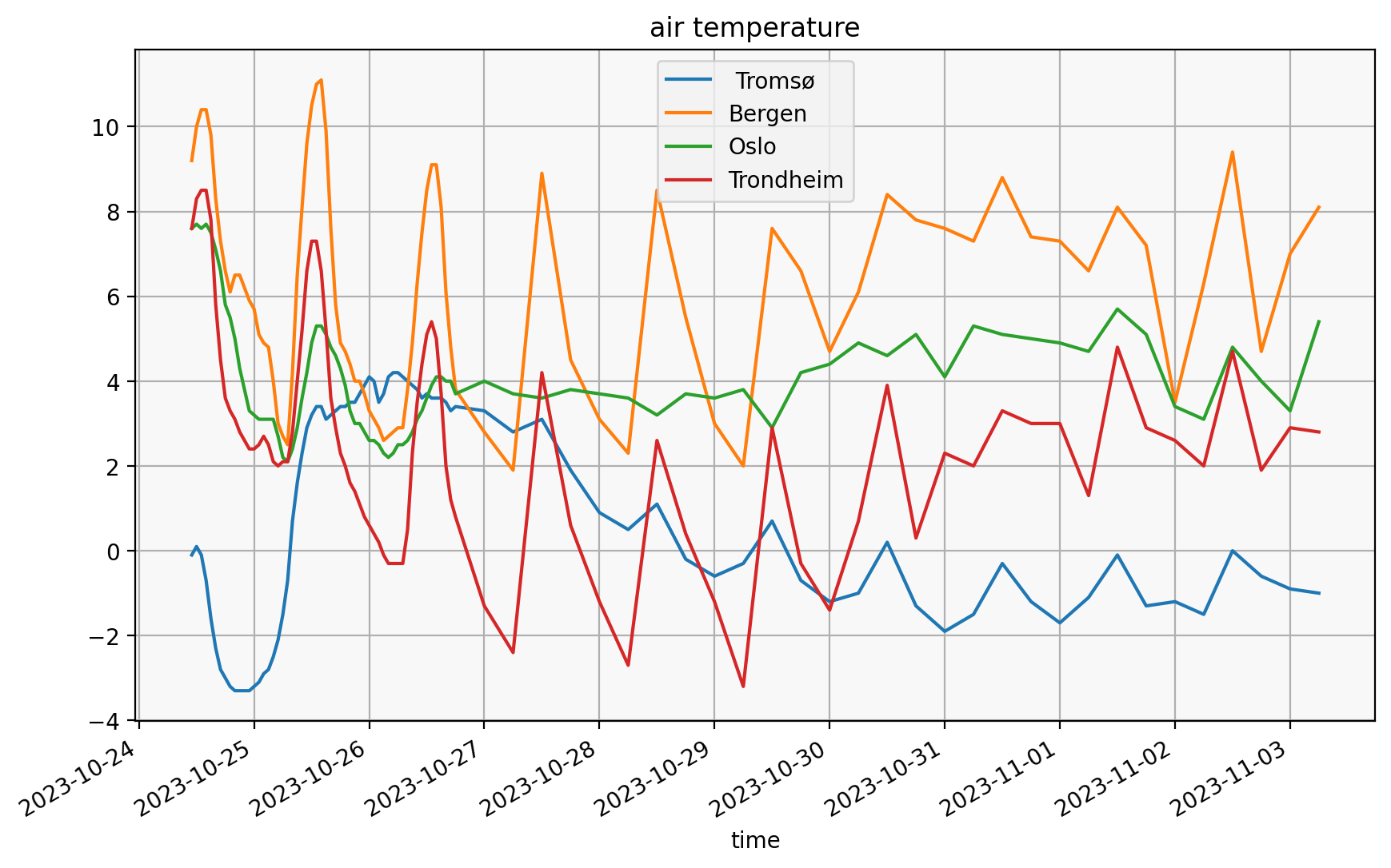
Example: weather forecasts#
forecasts.py contains some sample code from the Public APIs notebook
for fetching forecast data.
import pandas as pd
from forecasting import city_forecast

forecasts = pd.concat(
    city_forecast(city) for city in ("Oslo", "Bergen", " Tromsø", "Trondheim")
)
forecasts
| time | air_pressure_at_sea_level | air_temperature | cloud_area_fraction | relative_humidity | wind_from_direction | wind_speed | next_12_hours_symbol_code | next_1_hours_symbol_code | next_1_hours_precipitation_amount | next_6_hours_symbol_code | next_6_hours_precipitation_amount | city | |
|---|---|---|---|---|---|---|---|---|---|---|---|---|---|
| 0 | 2023-10-24 11:00:00+00:00 | 1017.7 | 7.6 | 99.9 | 82.5 | 59.8 | 3.3 | partlycloudy | cloudy | 0.0 | partlycloudy | 0.0 | Oslo |
| 1 | 2023-10-24 12:00:00+00:00 | 1017.5 | 7.7 | 99.8 | 80.1 | 58.4 | 3.4 | partlycloudy | cloudy | 0.0 | partlycloudy | 0.0 | Oslo |
| 2 | 2023-10-24 13:00:00+00:00 | 1017.4 | 7.6 | 99.3 | 79.1 | 56.9 | 3.4 | partlycloudy | cloudy | 0.0 | partlycloudy | 0.0 | Oslo |
| 3 | 2023-10-24 14:00:00+00:00 | 1017.3 | 7.7 | 98.3 | 78.7 | 54.1 | 3.4 | partlycloudy | cloudy | 0.0 | fair | 0.0 | Oslo |
| 4 | 2023-10-24 15:00:00+00:00 | 1017.3 | 7.5 | 93.0 | 79.2 | 53.1 | 3.6 | partlycloudy | cloudy | 0.0 | fair | 0.0 | Oslo |
| ... | ... | ... | ... | ... | ... | ... | ... | ... | ... | ... | ... | ... | ... |
| 81 | 2023-11-02 06:00:00+00:00 | 1008.3 | 2.0 | 48.4 | 84.4 | 171.3 | 2.3 | lightrainshowers | NaN | NaN | partlycloudy | 0.0 | Trondheim |
| 82 | 2023-11-02 12:00:00+00:00 | 1014.3 | 4.7 | 60.5 | 71.0 | 121.3 | 2.2 | lightrain | NaN | NaN | rainshowers | 2.1 | Trondheim |
| 83 | 2023-11-02 18:00:00+00:00 | 1010.1 | 1.9 | 100.0 | 85.6 | 144.1 | 2.4 | cloudy | NaN | NaN | cloudy | 0.0 | Trondheim |
| 84 | 2023-11-03 00:00:00+00:00 | 1008.1 | 2.9 | 99.6 | 85.3 | 152.2 | 2.4 | NaN | NaN | NaN | cloudy | 0.0 | Trondheim |
| 85 | 2023-11-03 06:00:00+00:00 | 1006.4 | 2.8 | 100.0 | 84.1 | 132.1 | 2.3 | NaN | NaN | NaN | NaN | NaN | Trondheim |
344 rows × 13 columns
fig, ax = plt.subplots()
ax.set_title("air temperature")
for city, city_df in forecasts.groupby("city"):
    city_df.plot(x="time", y="air_temperature", ax=ax, label=city)
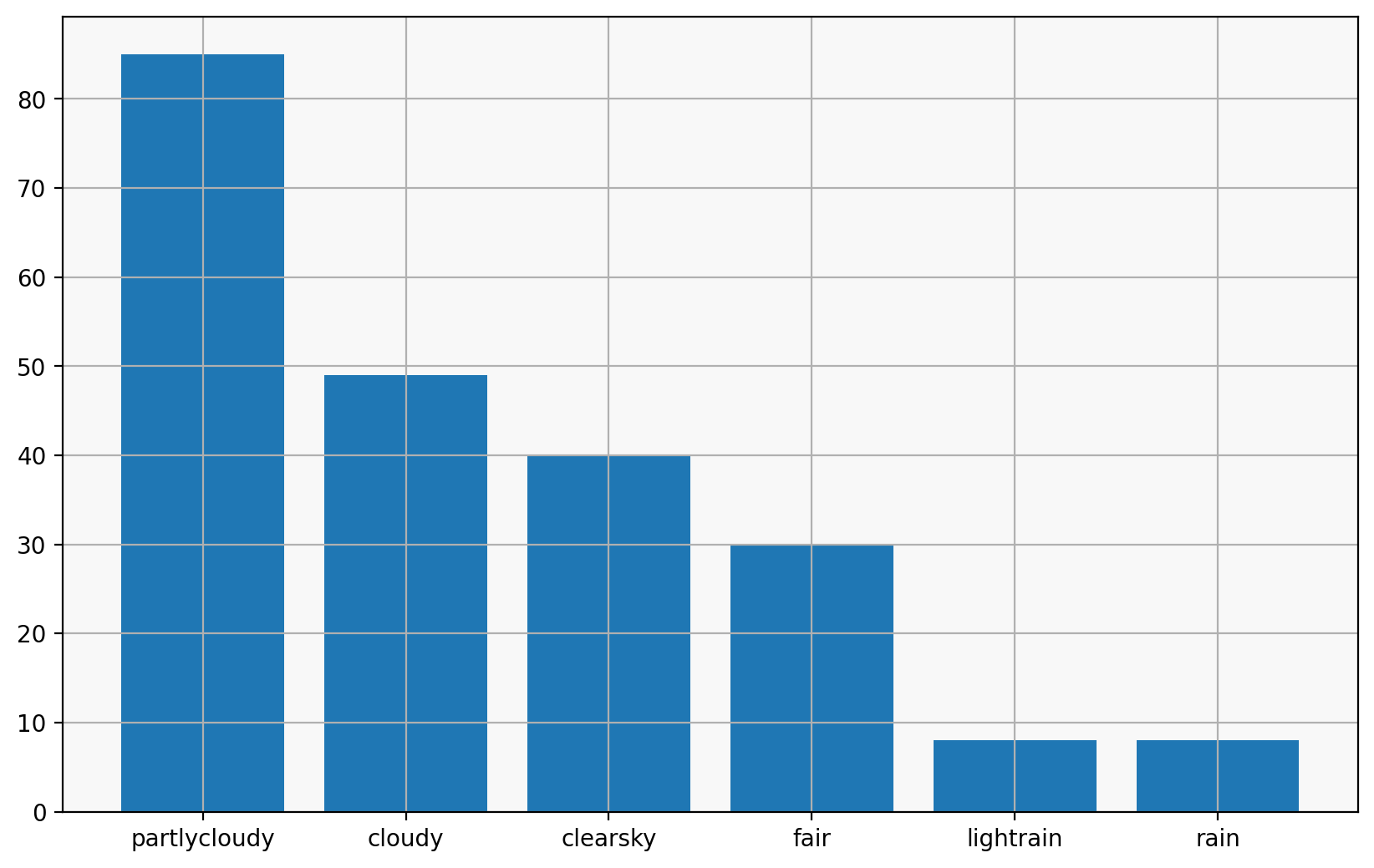
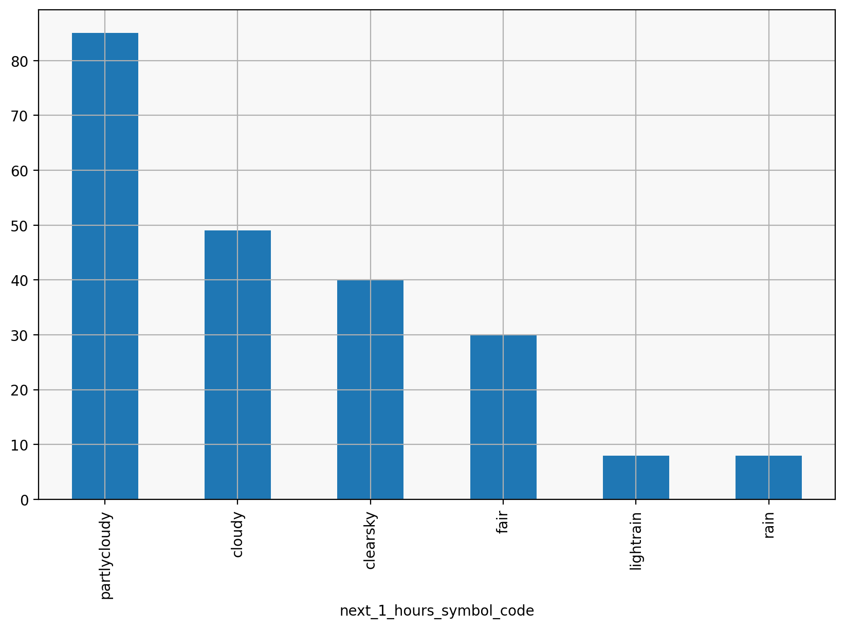
values = forecasts.next_1_hours_symbol_code.value_counts()
plt.bar(values.index, values.values)
<BarContainer object of 6 artists>
I can also use pandas’ own plotting methods to produce a similar chart:
values.plot(kind="bar")
<Axes: xlabel='next_1_hours_symbol_code'>
Summary#
matplotlib is a great and powerful tool, which lets you do just about anything.
pandas has some nice built-in plotting to visualise tabular data, but you can always extract the data and plot it with your own calls to matplotlib.
there’s often a lot of python code to group and slice and organize data for plotting.
Further reading#
Because matplotlib can do so much, a great way to get started is looking through the matplotlib gallery for a figure that looks like what you want, and start from there, replacing the sample data with your own.
The tutorials are a great way to learn more about how matplotlib works.
For example, this demo:
# %load https://matplotlib.org/stable/_downloads/77d0d6c2d02582d80df43b9b9e78610c/horizontal_barchart_distribution.py
"""
=============================================
Discrete distribution as horizontal bar chart
=============================================

Stacked bar charts can be used to visualize discrete distributions.

This example visualizes the result of a survey in which people could rate
their agreement to questions on a five-element scale.

The horizontal stacking is achieved by calling `~.Axes.barh()` for each
category and passing the starting point as the cumulative sum of the
already drawn bars via the parameter ``left``.
"""

import matplotlib.pyplot as plt
import numpy as np

category_names = [
    "Strongly disagree",
    "Disagree",
    "Neither agree nor disagree",
    "Agree",
    "Strongly agree",
]
results = {
    "Question 1": [10, 15, 17, 32, 26],
    "Question 2": [26, 22, 29, 10, 13],
    "Question 3": [35, 37, 7, 2, 19],
    "Question 4": [32, 11, 9, 15, 33],
    "Question 5": [21, 29, 5, 5, 40],
    "Question 6": [8, 19, 5, 30, 38],
}


def survey(results, category_names):
    """
    Parameters
    ----------
    results : dict
        A mapping from question labels to a list of answers per category.
        It is assumed all lists contain the same number of entries and that
        it matches the length of *category_names*.
    category_names : list of str
        The category labels.
    """
    labels = list(results.keys())
    data = np.array(list(results.values()))
    data_cum = data.cumsum(axis=1)
    category_colors = plt.colormaps["RdYlGn"](np.linspace(0.15, 0.85, data.shape[1]))

    fig, ax = plt.subplots(figsize=(9.2, 5))
    ax.invert_yaxis()
    ax.grid(False)
    ax.xaxis.set_visible(False)
    ax.set_xlim(0, np.sum(data, axis=1).max())

    for i, (colname, color) in enumerate(zip(category_names, category_colors)):
        widths = data[:, i]
        starts = data_cum[:, i] - widths
        rects = ax.barh(
            labels, widths, left=starts, height=0.5, label=colname, color=color
        )

        r, g, b, _ = color
        text_color = "white" if r * g * b < 0.5 else "darkgrey"
        ax.bar_label(rects, label_type="center", color=text_color)
    ax.legend(
        ncols=len(category_names),
        bbox_to_anchor=(0, 1),
        loc="lower left",
        fontsize="small",
    )

    return fig, ax


survey(results, category_names)
plt.show()
