Data visualisation in Python#
Making sense of data is complicated. We can often process patterns and trends in large amounts of data much more easily when presented in a visual way.
Take for example, this csv file. It’s a lot of numbers!
!head somedata.csv
x,s,c
0.0,0.0,1.0
0.06346651825433926,0.0634239196565645,0.9979866764718844
0.12693303650867852,0.12659245357374926,0.9919548128307953
0.1903995547630178,0.18925124436041021,0.9819286972627067
0.25386607301735703,0.2511479871810792,0.9679487013963562
0.3173325912716963,0.31203344569848707,0.9500711177409454
0.3807991095260356,0.3716624556603276,0.9283679330160726
0.4442656277803748,0.42979491208917164,0.9029265382866212
0.5077321460347141,0.4861967361004687,0.8738493770697849
We can read CSVs into pandas, which let us view it as a nice table and perform operations, but looking at the table doesn’t give us a lot more insight:
import pandas as pd

df = pd.read_csv("somedata.csv", index_col="x")
df
| s | c | |
|---|---|---|
| x | ||
| 0.000000 | 0.000000e+00 | 1.000000 |
| 0.063467 | 6.342392e-02 | 0.997987 |
| 0.126933 | 1.265925e-01 | 0.991955 |
| 0.190400 | 1.892512e-01 | 0.981929 |
| 0.253866 | 2.511480e-01 | 0.967949 |
| ... | ... | ... |
| 6.029319 | -2.511480e-01 | 0.967949 |
| 6.092786 | -1.892512e-01 | 0.981929 |
| 6.156252 | -1.265925e-01 | 0.991955 |
| 6.219719 | -6.342392e-02 | 0.997987 |
| 6.283185 | -2.449294e-16 | 1.000000 |
100 rows × 2 columns
But what if we plot it?
df.plot()
<Axes: xlabel='x'>
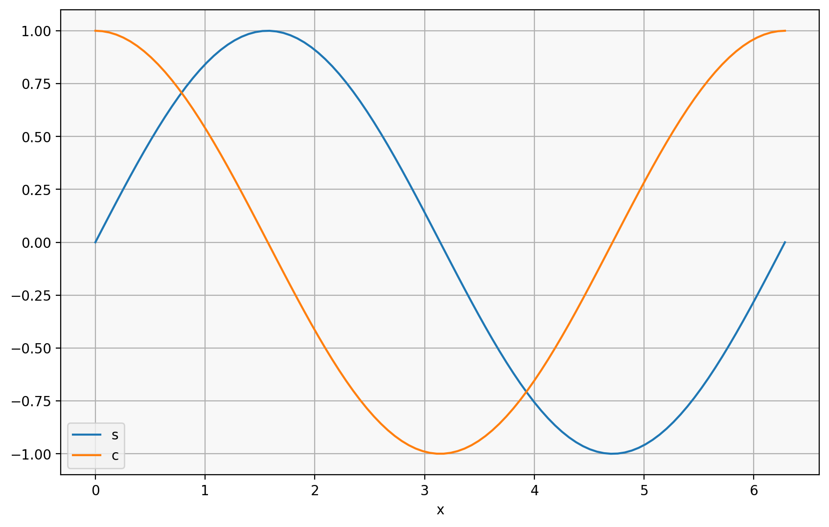
I recognize that! That’s \(sin(x)\), and \(cos(x)\)!
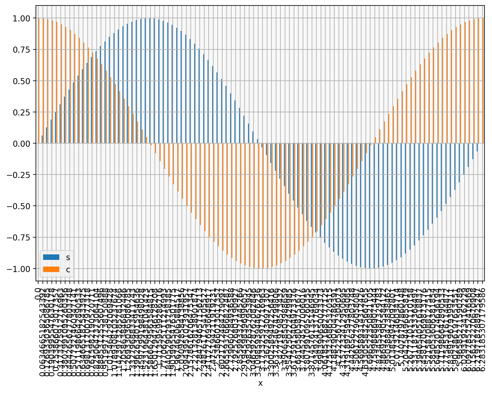
But what kind of plot we choose matters a lot! What if I’d chosen to use a bar chart:
df.plot(kind="bar")
<Axes: xlabel='x'>
or histogram:
df.plot(kind="hist", stacked=True)
<Axes: ylabel='Frequency'>
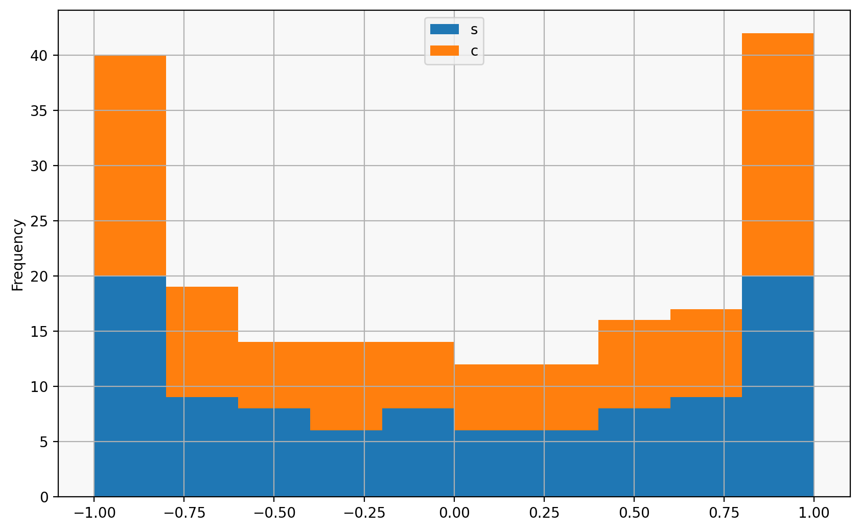
There are lots of ways to visualise data, and different kinds of visualisations help answer different kinds of questions about the data.
Data visualisation tools in Python#
There are lots of General purpose tools:
matplotlib (general purpose, extremely powerful)
altair (tabular data, declarative)
plotly (interactive)
bokeh (interactive)
bqplot (interactive, Jupyter-focused)
pyvista (vtk, 3d meshes)
lots more!
Domain-specific tools:
We are going to talk about matplotlib, which is what pandas’ DataFrame.plot uses,
and altair, which is also a dataframe-focused plotting library, which makes heavy use of pandas.